P5: CARRY OUT POST-PRODUCTION TECHNIQUES AND PROCESSES TO PRODUCE A FINAL ORIGINAL MEDIA PRODUCT IN LINE TO THE CLIENT BRIEF
Example Rush 1:
I believe this example rush would be perfect for an opening shot for my promotional video. Not only is it establishing the location, it is also filmed with the sun gleaming down onto the river, which makes the shot more attractive to an audience. This shot will encourage people to come and visit Cambridge (which is the purpose of my video) because it makes Cambridge look peaceful and picturesque at first impression.
Example Rush 2:
This next example rush is of Clare College, Clare College is the second-oldest surviving college of the University which makes it iconic. It’s also a very nice shot, establishing the grounds of the college. This gives off the Cambridge has more to offer than just shopping, my video is based on the shopping side but I’ve put in subtle shots which also encourage people to visit just for a day out as there is more to Cambridge than just shopping and I think this shot proves that.
Example Rush 3:
This next example rush is of the food court in the Grafton Centre. I like this shot because it establishes the spacious food court also promoting a few well known restaurants that are all affordable. This will appeal to people as the shot shows the space and peacefulness making people want to go and eat there.
Example Shot 4:
This shot is a Birdseye shot of people walking through the Grand Arcade. This shot is good to use in my video because it’s showing shoppers and various shops and a stall is also in the shot. This has potential to encourage people to visit because they can see other people there which makes them want to go.
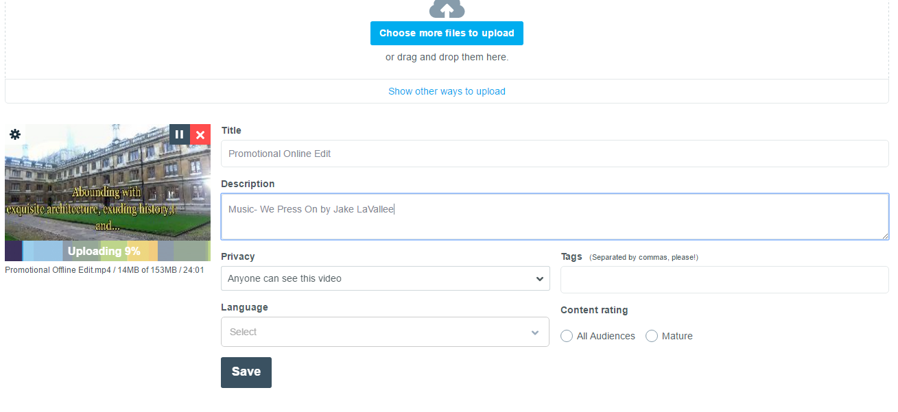
Offline Edit:
This is my offline edit, this doesn’t have a soundtrack and there is still things to improve on. But the general layout is an accurate template of what the finished edit will look like.
Feedback:
I asked 4 people for feedback on my offline edit, this is the feedback I received:
“One major positive of the video is that you’ve used a good choice of places to film and all the shots you’ve captured are great shots to promote Cambridge. To improve I would make the text with that comes up a tiny bit slower so people have more time to read it.”
“Overall the video is of a good standard, the only criticism I have is that some of the grammar isn’t right, I would make sure the grammar is correct for the finished product; for example you haven’t added an accent or an apostrophe for the word ‘café’s’.”
“Really nice panning shots, these shots give a sense of the layout of the places you’ve filmed, the editing is really good too I like the transitions because it gives the video a more professional look, one thing I would say to improve is that you’ve used different fonts in some of the captions, use the same font throughout”
“I think this will be really good when the music is added, I think the shots are great and so is the editing. The captions are really detailed and you give the audience the information they need. I like the text, I think without the text the video wouldn’t make much sense so the text helps the audience connect with it easily. One negative would be that some of the shots end too quickly, some of them I think the audience need to see more of”
After receiving this feedback I plan to edit parts of my video to satisfy my audience more. I will be correcting all of the grammar and spelling mistakes I have made and I will also be changing the fonts so they’re more or less all the same apart from the title page and ending page because I think having a bigger font works better for those shots. I will extend some shots that I think have more potential and I will make the text subtitles a bit longer giving people more chance to read them. I will also be adding a sound track, the soundtrack I am adding is un copyrighted it’s a track called ‘We Press On’ by Jake LaVallee. The track is un copyrighted but I have been asked to credit the owner, so I shall be doing that when I upload the final edit.
M4: DEMONSTRATE HOW THE EXPORTED MEDIA PRODUCT MEETS THE CLIENT BRIEF
Uploading the online edit:
I uploaded the online edit to vimeo partly because vimeo is one of the best video sharing sites and it is easy to find and play videos on there. As I want this video to be reachable by my target audience having it on vimeo helps promote it as you can share vimeo videos onto any social media meaning my video and be shared reaching out to the target audience. Also the video can be played from vimeo on any device that has internet availability making it easy for it to be played on tv screens at railways, bus stations and airports.
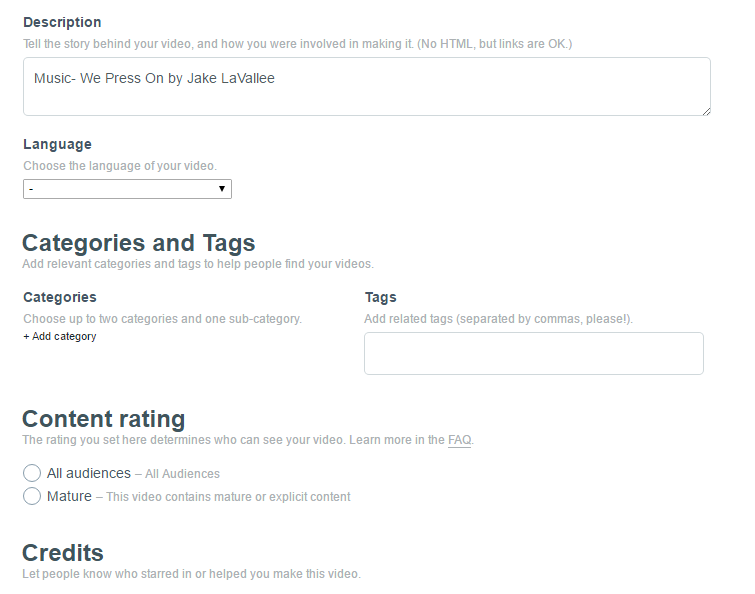
Vimeo also lets you add tags e.g ‘Cambridge’ meaning whenever anyone searches ‘Cambridge’ my video will come up in the suggestions, this is another way of promoting my video and making it reachable to my target audience. There is also an option for ‘Categories’ for example I could put ‘Places to visit in England’ as the category meaning when people look through the categories they will see it. Lastly, there is also an option for audiences, this option lets you pick whether your video is acceptable for mature audiences or everyone. In this case, my video is for anyone any age as it does not contain any mature or explicit content.
Online Edit:
Editing the Online Edit:
How does my finished product meet the clients brief?
My finished product meets the clients brief because the video has fulfilled its purpose to promote Cambridge in a positive way to attract shoppers from different areas of England and even tourists. The video has a professional look and looks good for a video to put on in bus stations, airports and train stations. The music fits well with the video, making the video flow perfectly. The video includes relevant factual information that the audience needs, this avoids confusion from the audience as everything is explained in the video.
The shots in my video are all relevant and I have carefully picked out good places to film guaranteeing attention from the audience. I filmed on a sunny day which makes the video more appealing to the audience, making Cambridge look like a happy sunny place. I have used a lot of yellow in the fonts, the reason for this is because yellow is a happy colour and gives the video a positive feel.
Review:
Overall I am happy with the finished product and I believe it meets the clients brief more or less. I made a few minor changes such as I was going to do a voice over but then I thought if it’s going to be played in a busy bus station, train station or even an airport the audience won’t be able to hear the voice over clearly as they’re busy loud places. Because I’m advertising shopping in a big city I want viewers to remember the video so it sticks in their heads and fully grabs their attention and I thought a catchy soundtrack and subtitles would be easier for the audience to view.
My strengths were that I used a good variety of shots, the shots cover shopping in Cambridge well for a 2 minute video. Another strength would be the editing, I think transitions work well and fit to the video.
My weaknesses were that some of the shots were quick and if I recorded longer footage I would’ve had more to add. Another weakness is that the sub titles are quick so you have to read them fast, if I were to do this task again I would make them longer and shorter so there’s not as much writing to read.
D1: ANALYSE HOW POST PRODUCTION TECHNIQUES AND PROCESSES CREATE MEANING IN THE MEDIA PRODUCT TO MEET THE CLIENT BRIEF
Analysis Post Production:
My ‘Welcome to Cambridge’ promotional video went successfully with only a few minor changes in post production. At the start of my post production I imported my shots and pictures onto the desktop and from there I renamed all the shots with a relevant name. I then started a new project on Final Cut Pro and imported my media. After I imported it, I picked all the shots I was going to use and I started editing. My first job was to do the opening shot with a title, for this I chose a picturesque shot of the River Cam with the sun gleaming off the river and a clear blue sky. I added the title to this and used yellow and white as my colours, the reason why I chose these is because yellow is a lively, positive and happy colour which subconsciously makes an audience have a good feel for the video. This clever technique is used by many people, the colour yellow and other bright happy colours are used a lot in promotion. The colour white is also a simple colour, which gives a sense of peacefulness and simpleness.
I then moved on the adding more shots, I added another shot of the River Cam from a different angle and a shot of Clare College before I used a morphing transition that takes the audience straight to the view of the Grand Arcade entrance. This is where I begun to add captions that are encouraging people to visit Cambridge, I used a lot of persuasive language and rhetorical questions to grab the audiences attention.
The shots I then continued to add were ones of the inside of the spacious Grand Arcade, I added a few Birdseye shots of people walking around the area of which I sped up so the audience won’t get bored. I added a shot of people sat drinking coffee and having conversations with their friends and family, this gives off the impression Cambridge is also a great place to visit with family, making the audience feel like it would be a good family day out.
I then added a slideshow of pictures, using all the well known high street and premium shops. The images have a dissolve transition on them making them smoothly dissolve into one another, these only last a couple of seconds each so they don’t bore the audience. I then added shots of the Grafton Centre, I used an establishing shot of the food court which advertises and promotes the food Cambridge has to offer as well as just the shopping.
Furthermore I continued to add shots, I added shots of the Market Square. The shots of the Market Square show different stalls and a long shot of the whole market itself in action. I then finish with another slideshow of pictures of restaurants, bars and cafes to promote food again. This will engage the audience as I have picked out well known and local food retailers, making the video more personal to Cambridge rather than having general restaurants that you can get anywhere. For example I have used a photo of the front of Cambridge Wine Merchants which is a bar exclusive to Cambridge.
I then finished the video with a shot of Kings College, this is a nice ending because it’s subtly advertising what else Cambridge has to offer apart from shopping. Again, I used a yellow font to end it, which will make the audience feel a positive way about the video and about Cambridge. Kings College is also a famous and iconic building making Cambridge stand out to other cities.
To give the audience information, I used subtitles in my video. These subtitles simply explain what’s going on in Cambridge and what it has to offer. I used the same font for this, it’s an orangey yellow font with a black outline to make it stand out, I also added a lens flare which makes the subtitles have the audiences full attention so they read it.
