P2: GENERATE IDEAS FOR A NEW INTERACTIVE MEDIA PRODUCT FOR A CLIENT BRIEF
Purpose
The purpose of this interactive website is to raise the profile of the city on the internet making it more popular to tourists and to educate and inform the general public/tourists about Cambridge and upcoming events happening in the city. Locals can also make use out of this interactive website as it will inform them on upcoming events in Cambridge. The website will make getting around and knowing Cambridge easier for tourists. When the website is fully developed, the council want to place touchscreen information kiosks showing this interactive website. These kiosks will be very useful for locals but especially tourists.
Client needs
The interactive website will be easy to use so information can be found quickly and used effectively and to its full potential. The product will be able to provide the user with up to date information about Cambridge and events that are upcoming. The client wants the product to do as follows:
Target Audience
The target audience is a mass audience, the demographic of age range would be roughly 16-60. The reason for this is because the interactive website caters for anyone that is local to the city and wants to see information on upcoming events and visitors to the city who want information about the city. The age range varies from a younger audience to an older audience as tourists and locals can vary in age, also it's highly unlikely someone who is younger than 16 would be travelling without an accompanied adult and people who are 60 plus probably wouldn't use interactive websites and would stick to more traditional ways of finding out information by using leaflets or maps . I believe that the type of people that will be using this product will be a younger generation and their parents. The target audience will also be of those who participate in disposable income, which narrows the target audience down to middle class and upper class people as they'll have that spare money to go and visit places, eat out and shop and also own iPhones etc.
Target audience needs
An older audience (30-60) will want a website that is very simple and easy to navigate around with big fonts so they can clearly read the information. To cater for the older audience I will not include a sign up process because older people won't have time to be signing up for the app and it will put them off using it. An younger audience will want the website to be bright and colourful so it grabs their attention as well as a lot of pictures. Information wise, a younger audience (students for example) will probably want information on shopping, clubs, student hang outs and bars, where as an older user may want to know about the highly rated restaurants or pubs in Cambridge as they'll most likely have more disposable income to spend on posh restaurants and quaint pubs than a younger audience would.
Content
The website will include;
Format
The format is a website that will work across different technologies. For the format it is important I consider compatibility across different platforms, in other words I have to make sure that the website runs smoothly and works across a range of technologies that have internet access such as laptops, PC's, phones, iPads etc. Websites that are built by using either HTML5, CSS3 and JavaScript can work across different platforms and are compatible over different devices. I will have to make sure my website it compatible among different devices and on different web platforms.
Budgeting
In terms of budgeting I will have to think about the assets I will be using on the website in terms of copyright. As I will be using copyright free materials that are for commercial use. I will also need to think about the cost of web hosting, I can look at website builders such as Fasthosts, Weebly, GoDaddy and Wix where I can also purchase a domain name for my website which is crucial as people will need a domain name and link to be able to access the website. I will have to get a quote from each website builder to be able to price up and identify which one will be suitable for my budget. Last of all, as I am making the interactive website myself I will not be needing a website designer, but if I were to do this task in the real world I would need a website designer I would have to decide if I wanted a high end designer or a local one therefore these prices would vary. For a high end website designer it would cost on average £75 per hour but if I were to go local and use a lower end website designer it would cost roughly £29 per hour.
The purpose of this interactive website is to raise the profile of the city on the internet making it more popular to tourists and to educate and inform the general public/tourists about Cambridge and upcoming events happening in the city. Locals can also make use out of this interactive website as it will inform them on upcoming events in Cambridge. The website will make getting around and knowing Cambridge easier for tourists. When the website is fully developed, the council want to place touchscreen information kiosks showing this interactive website. These kiosks will be very useful for locals but especially tourists.
Client needs
The interactive website will be easy to use so information can be found quickly and used effectively and to its full potential. The product will be able to provide the user with up to date information about Cambridge and events that are upcoming. The client wants the product to do as follows:
- Easy to use.
- Provide the user with a positive experience.
- Provide relevant and up-to-date information about the town.
Target Audience
The target audience is a mass audience, the demographic of age range would be roughly 16-60. The reason for this is because the interactive website caters for anyone that is local to the city and wants to see information on upcoming events and visitors to the city who want information about the city. The age range varies from a younger audience to an older audience as tourists and locals can vary in age, also it's highly unlikely someone who is younger than 16 would be travelling without an accompanied adult and people who are 60 plus probably wouldn't use interactive websites and would stick to more traditional ways of finding out information by using leaflets or maps . I believe that the type of people that will be using this product will be a younger generation and their parents. The target audience will also be of those who participate in disposable income, which narrows the target audience down to middle class and upper class people as they'll have that spare money to go and visit places, eat out and shop and also own iPhones etc.
Target audience needs
An older audience (30-60) will want a website that is very simple and easy to navigate around with big fonts so they can clearly read the information. To cater for the older audience I will not include a sign up process because older people won't have time to be signing up for the app and it will put them off using it. An younger audience will want the website to be bright and colourful so it grabs their attention as well as a lot of pictures. Information wise, a younger audience (students for example) will probably want information on shopping, clubs, student hang outs and bars, where as an older user may want to know about the highly rated restaurants or pubs in Cambridge as they'll most likely have more disposable income to spend on posh restaurants and quaint pubs than a younger audience would.
Content
The website will include;
- History of Cambridge
- Upcoming events guide
- Image gallery
- Map
- Best places to eat
- Best clubs and bars
- Shopping centres
Format
The format is a website that will work across different technologies. For the format it is important I consider compatibility across different platforms, in other words I have to make sure that the website runs smoothly and works across a range of technologies that have internet access such as laptops, PC's, phones, iPads etc. Websites that are built by using either HTML5, CSS3 and JavaScript can work across different platforms and are compatible over different devices. I will have to make sure my website it compatible among different devices and on different web platforms.
Budgeting
In terms of budgeting I will have to think about the assets I will be using on the website in terms of copyright. As I will be using copyright free materials that are for commercial use. I will also need to think about the cost of web hosting, I can look at website builders such as Fasthosts, Weebly, GoDaddy and Wix where I can also purchase a domain name for my website which is crucial as people will need a domain name and link to be able to access the website. I will have to get a quote from each website builder to be able to price up and identify which one will be suitable for my budget. Last of all, as I am making the interactive website myself I will not be needing a website designer, but if I were to do this task in the real world I would need a website designer I would have to decide if I wanted a high end designer or a local one therefore these prices would vary. For a high end website designer it would cost on average £75 per hour but if I were to go local and use a lower end website designer it would cost roughly £29 per hour.
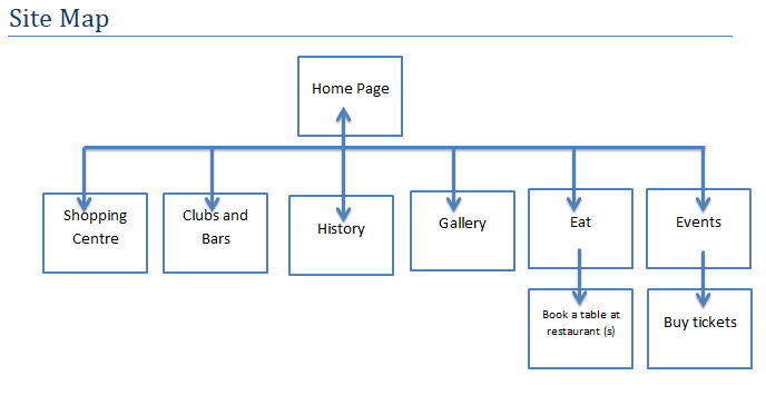
Site Map:
This site map helps me chart the desired navigation of the website, it shows the screens that the website will have and charts the links between the home page to the pages off it.
This site map helps me chart the desired navigation of the website, it shows the screens that the website will have and charts the links between the home page to the pages off it.
Mood Board:
This mood board represents the target audience of the website, the type of audience using it are going to be locals of Cambridge, tourists and students.
This mood board represents the target audience of the website, the type of audience using it are going to be locals of Cambridge, tourists and students.

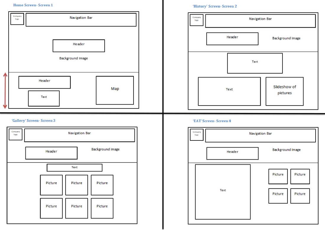
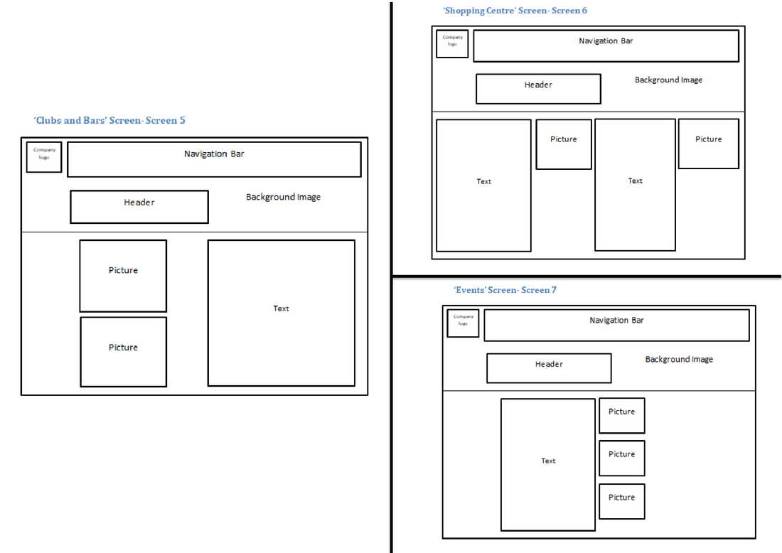
Storyboard:
This is the storyboard of my website, I have 7 different screens in total showing the elements I will be having in each screen.
P3: PRODUCE A PLAN FOR THE CREATION OF THE INTERACTIVE MEDIA PRODUCT FROM THE GENERATED IDEAS
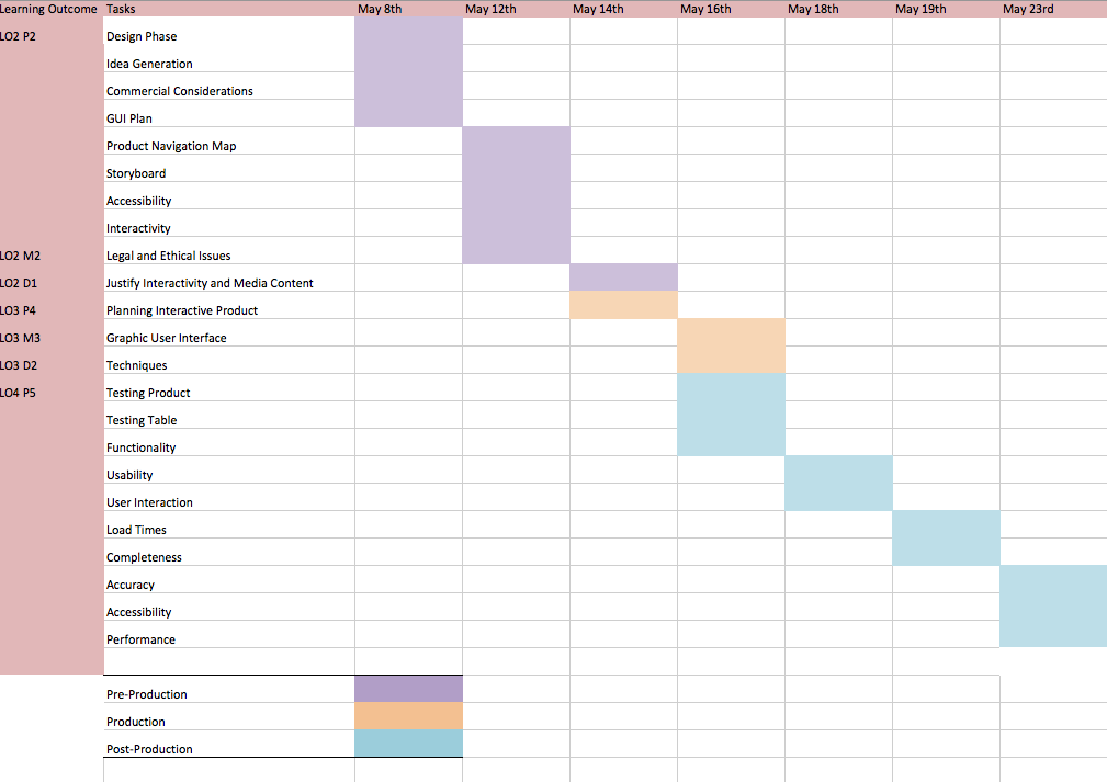
Production Schedule - Gantt Chart
This Gantt Chart show the activities that I need to do as well as timings and dates these will get done with enough time at the end to consider user testing - this is important because after user testing I could find there are many functions that need to be revised.
Layouts:
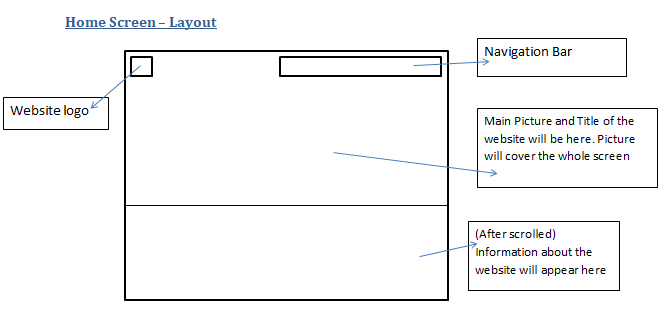
The layout of my home screen will be as above, I want the visitor of the website to be greeted by a picture of Cambridge, this picture will cover the whole screen and have the title of the website in the centre, once the visitor has scrolled down they can read further information about the website. The home page will have a logo, the logo can be clicked when on any page which will automatically take the user back to the home page. The navigation will appear at the top where the user can decide what page they are interested in viewing.
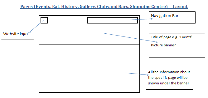
The pages that will appear on the navigation bar will have the same layout, I believe this won't make the website over complicate or confuse users. Every page will have a picture and then the title of the page on top of it, the relevant information of that page will follow underneath. On every page the navigation bar will be present, this is so users can navigate easily around the website without there being too many drop down menus or anything that could be complicated to use. The information is easy to access as all the user has to do is scroll down.
Layout Inspirations:
|
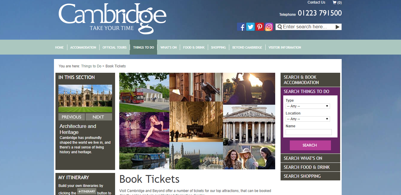
Having researched other websites similar to the one I will be making, I have gained some inspiriation in terms of layout. This is the official Visit Cambridge website where you can book tickets to the attractions in Cambridge. The website is laid out with a navigation bar at the top which lets users navigate simply through the website and there are a lot of eye catching pictures on the front page which sells Cambridge. However, I did find this website slightly confusing to use as there was a lot of information and links to take on board - so I hope to make my website more simple than this.
|
|
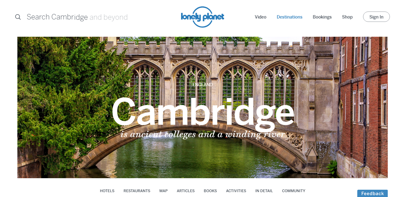
I also have taken some inspiration from the Lonely Planet Cambridge website, I really love the layout of this as it is eye catching yet simple. The picture in the centre with 'Cambridge' written in the centre is effective because you put a picture to the name instantly. The navigation bar is at the bottom of this website which is slightly different to the other websites as most have it at the top. I think personally prefer the look of the navigation bar at the top as it's easy to see.
|
|
|
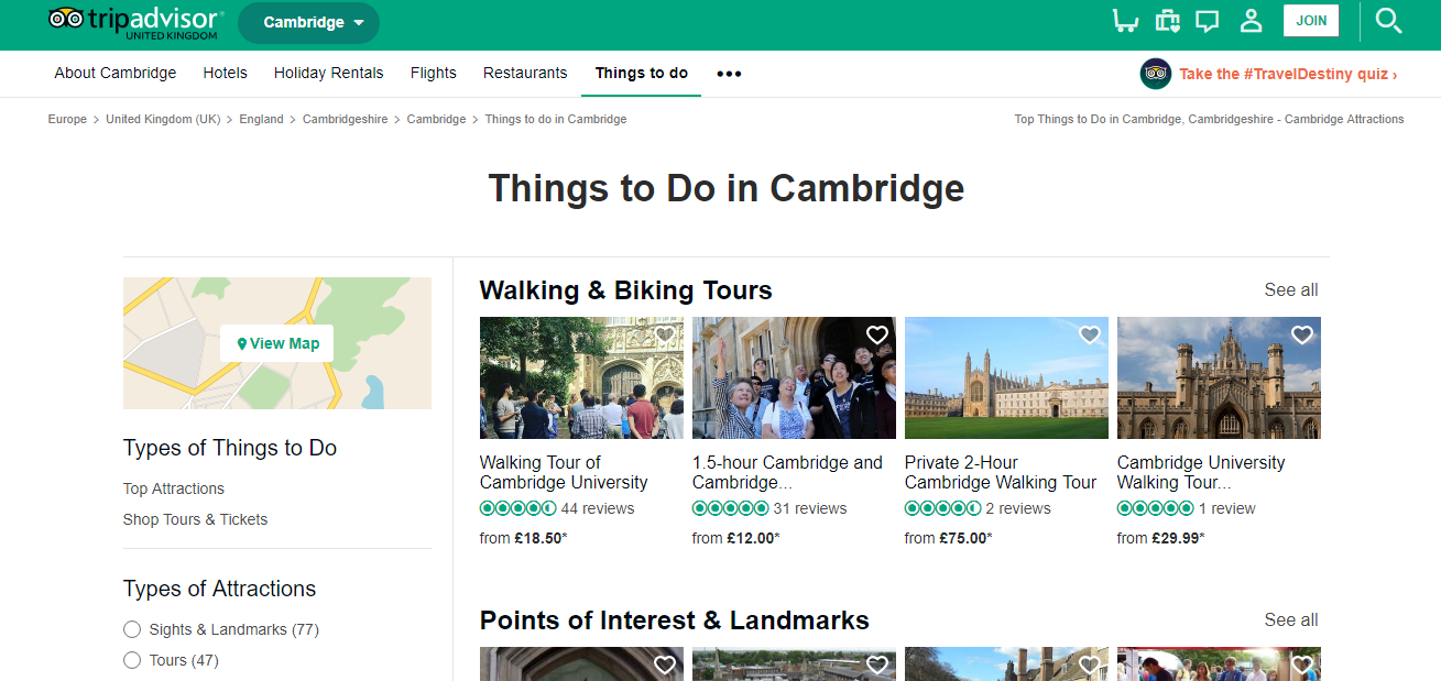
Lastly, this is the TripAdvisor website for Cambridge. This website is very simple to use and everything you might need to know straight away is on the first page which means the user doesn't need to navigate through to find exactly what they want as the main things are covered in the first page. The layout isn't as inspiring as the websites I have explored, the reason for this is because it isn't as aesthetically pleasing and is just quite boring with limited colours.
|
House Colours:
|
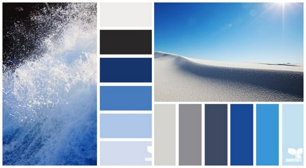
The colour scheme I want to go for is a blue, white, black and grey scheme. I believe these colours are really easy on the eye and could give off the illusion of a clear blue sky which is appealing for everyone therefore they will see Cambridge as a appealing place. Aside from the hidden message these colours offer, in terms of font colours I can use black and grey these colours would make the font easy for the user to read.
|
|
Graphical User Interface (GUI)
The audience will be able to interact with the content and features available on the website easily this is because the website will be able to run on Windows and Apple operating systems. Both of these operating systemswill allow users to use a multiple of features to use on the online product. Users will be able to use a pointer if they are viewing the website on a laptop, a touchscreen enabled device will allow users to select things directly. Icons can be clicked on by the pointer or if its touchscreen then directly - because the client brief stated it wanted to have the website on touchscreen kiosks it will allow users to use this features at ease. Users if they are viewing the app on both laptop or phone/ iPad they can have multiple windows up to divide the website into different pages to view at the same time. Lastly the graphical user interface will let users achieve commands by simply selecting a choice from a menu, this will allow users to navigate easily around the website as they can see the command they want from the menu and be taken straight to it, this is the same if its on a smartphone or a website.
The audience will be able to interact with the content and features available on the website easily this is because the website will be able to run on Windows and Apple operating systems. Both of these operating systemswill allow users to use a multiple of features to use on the online product. Users will be able to use a pointer if they are viewing the website on a laptop, a touchscreen enabled device will allow users to select things directly. Icons can be clicked on by the pointer or if its touchscreen then directly - because the client brief stated it wanted to have the website on touchscreen kiosks it will allow users to use this features at ease. Users if they are viewing the app on both laptop or phone/ iPad they can have multiple windows up to divide the website into different pages to view at the same time. Lastly the graphical user interface will let users achieve commands by simply selecting a choice from a menu, this will allow users to navigate easily around the website as they can see the command they want from the menu and be taken straight to it, this is the same if its on a smartphone or a website.
Interactivity and accessibility
As you can see from my sitemap and other planning documents it is clear that my website will be interactive. My website will include photos, videos, links to external websites where users can buy tickets etc. There will be many forms of interactivity on my website that will make the website a good website for people seeking information about Cambridge. One of the interactive features that will feature on my website is maps, the map will let the user know where they are so they can direct themselves around Cambridge easily, when you click on the map it will come up with google maps and from there you can get directions, view in satellite view and many other features of maps. Another main interactive feature that the website will have is photos, the photos of the restaurants for example will be hyperlinked to that restaurants web page so users can book tables or learn more about the restaurant. Live links to external websites will be really useful and important for the user as for example, the link could link them through to a page where they can buy tickets for the attractions of Cambridge.
Accessibility is very important when thinking about producing a website, the user needs to be able to access the website easily therefore I need to think about whether the website can run on different operating systems, browsers and if it is supported by them. After doing a test website I will be able to know what browsers support the website or not but I don't think I will run into too many problems as I know Windows and Apple operating systems support the website and browsers that aren't as popular as lets say Chrome or Safari such as FireFox support JavaScript commands which will allow my website to run smoothly. I also need to take into account the accessibility for disabled users, this means I will have to make text an easy reading size also make the images responsive. It is important that my website can be accessed by everyone, one way for this to be possible is to have settings at ease. The settings will allow users to zoom in or zoom out on the page if it's text that they find difficult seeing, on most browsers settings can be accessed in the top corner and smartphones can be tailored towards ones specific needs in settings so this shouldn't be an issue but is something to be aware of.
Sourcing assets and optimisation
It is vital I source my assets for my interactive website, my client has asked for non copyrighted or self produced content only. Most of my assets if not all will be online resources and assets which I am allowed to use, I plan to use royalty free images to avoid any copyright laws. Non copyrighted images are easy to find online and are mainly all free of charge. I also understand that if I use any of my own content it will have to be optimised so it is web ready, this could mean having to reformat image files into a .png format which means it will be ready for viewing across mobile and other interactive devices. This could also mean that if I use my own video content, I will have to convert the video file to an MP4 format, making sure I use the H.265 compression technique in the editing suite - this will make sure the video is suitable for being embedded into the website to ensure a high quality user experience.
It is vital I source my assets for my interactive website, my client has asked for non copyrighted or self produced content only. Most of my assets if not all will be online resources and assets which I am allowed to use, I plan to use royalty free images to avoid any copyright laws. Non copyrighted images are easy to find online and are mainly all free of charge. I also understand that if I use any of my own content it will have to be optimised so it is web ready, this could mean having to reformat image files into a .png format which means it will be ready for viewing across mobile and other interactive devices. This could also mean that if I use my own video content, I will have to convert the video file to an MP4 format, making sure I use the H.265 compression technique in the editing suite - this will make sure the video is suitable for being embedded into the website to ensure a high quality user experience.
M2: EXPLAIN THE LEGAL AND ETHICAL ISSUES RELATING TO PRODUCT IDEAS
When planning my app I need to consider legal and ethical issues so that my website is suitable for the market. As I am making a website there are two major issues that are directly related to interactive websites, the first one is personal data protection. Personal data protection is The Data Protection act that covers the protection and security of an individuals personal infomation as a person we are entitled to our name, address and financial details to be kept safe. If I am thinking about using a sign up method where the user has to supply their name and email I will have to make sure user data is kept safe through encryption. I am aware that identity theft is a major issue with some websites and there is a possibility that personal information could be hacked therefore I will have to use secure socket layers to ensure my website is secure. I haven't planned to use a sign up method as I want a user to be able to access at ease and use the website when out so therefore they won't have time to sign up which might put them off from using the website. But this feature could be a development of the website in the future, I could send users emails of what's on in Cambridge through email which will mean I will have to ask for their name and email addresses.
The other main issue related to websites is cyber stalking and bullying. This applies to most social interactive products on the market, this issue doesn't apply to my website as such as I don't plan on using any social interaction on my website although in the future the website could develop and there could be a comments section for example where users can leave reviews of their time in Cambridge. In this case, i would have to be monitor all comments made by users so that before they are published onto the website they go through a moderator who can check it is suitable to be published and that the content is neither offensive or inappropriate. Also content could be reported by other users if they find it offensive which could therefore risk the use of the website and stop users from using it if they don't like the content being posted.
The copyright rule is largely relevant to my website, I am aware of this as the client has specifically asked for all content to be non copyrighted or content of my own to be used to avoid this problem. So it is my responsibility to make sure all content is copyright free. The Copyright, Designs and Patents act simply states that creators of their own work are in control of it and the use of it e.g. where it is sold or where is it used. This is relevant to my website as I need to be sure that when I am sourcing my assets none of the assets are protected by copyright, to make sure I am one hundred percent safe of this I would reference the artist so that they are credited for the artwork and not me. The icons in my website will be created by me therefore I don't need to worry about any copyright issues with icons, headers or my navigation bar. To protect my app a patent can be published e.g my details as a creator on the website so that no one steals my website and claims its theirs, this is a government license that prevents others claiming it their work as the license states the product is mine .
I will ensure that I source all information on my website as I don't want to run into problems with inaccuracy, this is a legal issue depending on the website I gather the information from as there is a possibility that the information is false or inaccurate which would break the legal code of accuracy which will then mean my website will be taken down and the company supplying the inaccurate information could get sued.
In terms of ethical issues I need to be vigilant when producing content for my website, some ethical issues relevant to my website is as follows. The first issue would be misrepresentation, this is something that I need to be careful of as I am representing Cambridge as a city on my website therefore it is my duty to represent it accurately and well. I can not be biased when producing content for the website such as sharing my own personal opinions, I have to keep it neutral and promote Cambridge as that's the purpose of the website. Decency is another issue, but I will not be using any indecent content on my website and I will not be using any indecent or explicit language on my website that could possibly offend a user. Another ethical issue is libel laws, this is similar to misrepresentation as in it is to do with false statements are being put out on the internet, this will not be applicable in my website as I will use accurate information that isn't meant to mislead or be unethical the purpose is to obtain a promotion standard and sell Cambridge but using accurate information that isn't at all false.
D1: JUSTIFY THE PLANNED INTERACTIVITY AND THE RANGE OF MEDIA CONTENT TO MEET A CLIENT BRIEF
