P3: DEVELOP AN ORIGINAL STORY TO BE TOLD WITHIN THE GRAPHIC NOVEL OR COMIC
Proposal:
Learning Outcome 2 Proposal PDF by Sarah Broughton on Scribd
P4: CREATE A SCRIPT FOR THE PLANNED STORY
Comic Script by Sarah Broughton on Scribd
P5: PLAN THE STRUCTURE AND PANEL LAYOUT FOR THE PROPOSED ORIGINAL GRAPHIC NOVEL OR COMIC
Below is a slide show in order of the type of panels I am going to be using in my comic. This includes page breaks and panel breaks.
|
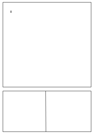
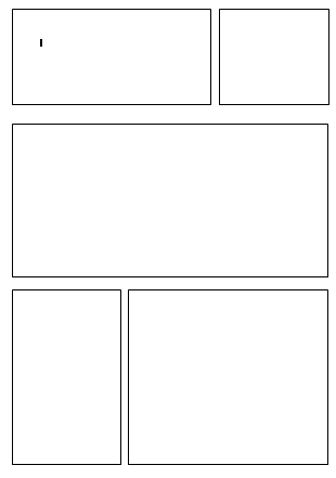
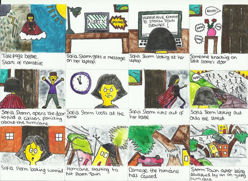
The first page has 3 panels, one being the centre of attention which is the first one and then two smaller panels below it. The reason for this is because we are introduced to the character on page one and we get an introduction of her within the dialog of that panel, the story then starts at the two bottom panels. I believe this will be an effective way of having the first page purely because it shows Sofia Storm is the main character and the centre of attention within the comic. The first panel will begin with a low angle shot of Sofia Storm, here the reader will understand her background story and how she's a superhero. The story will then begin in the second two panels at the bottom, here is where Sofia Storm gets a notification on her laptop saying that a hurricane is coming to Storm Town, the prop in this panel will be the laptop. Again in the last panel, the laptop will be the prop and there will be an over the shoulder shot of Sofia Storm.
|
|
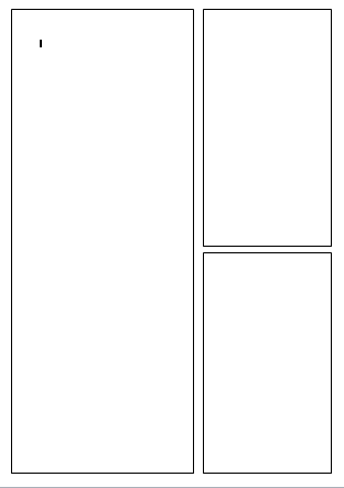
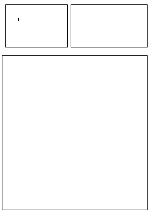
Page 2 will have a layout of a long vertical panel and then two smaller square panels on the side, the reason for this being is because we are introduced to a new character here which is the citizen knocking on the door, I believe having a full body shot of the citizen will help the reader understand the difference between the citizens of Storm Town and Sofia Storm, as she dresses like a superhero where as the citizens are just in normal clothes, so the reader will be able to distinguish this. The two smaller panels will show more close up shots of Sofia Storm and the citizen which will show facial expression more clearly.
|
|
|
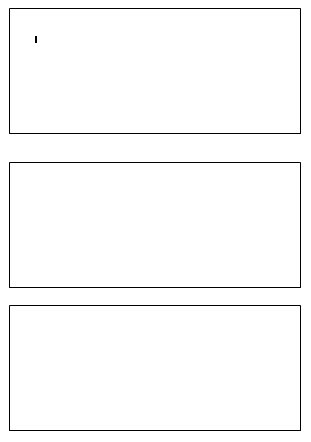
Page 3 will have 3 panels of the same size, this is because it uses a range of different shots to present the narrative, so in the first panel there will be a long shot of Sofia running out of her house to go and help, in the second panel there will be a long shot of Sofia looking out onto a street, a long shot is really vital for this as the audience will be able to see the street clearly. Lastly, the third panel is an extreme close up of Sofia's face looking worried, because it is quite a large panel the extreme close up will work really well and present Sofia's emotions and reaction to the chaos effectively.
|
|
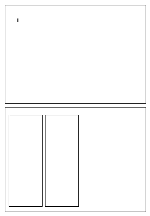
Page 4 is very much a page for setting the scene, here we see the damage the hurricane has done so for this there are two very large panels and two smaller ones within one of the large ones. The reason for this is because there will be two extreme long shots of the scene and then the smaller panels are for more close up detail of the damage the hurricane has caused. This will be effective as the reader can see the location and really connect to the visual narrative of the chaos and disturbance of this hurricane which is designed to set the scene.
|
|
|
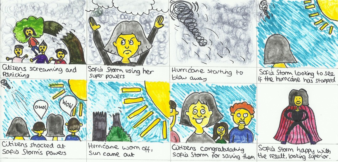
Page 5 has 5 different panels, including two smaller panels, two middle sized panels and one large one which is central. This is because this is the part of the comic with the most dialog, so we have to see more close up and facial expressions as well as mid shots to see what is also happening in the story. A shot of Sofia Storm, the citizens and the hurricane will all be seen on this page which is a reason for a lot of panels.I also believe this really gives the story a comic book feel as the older comics tend to have a lot of panels within the story so I am trying to incorporate that look to this comic as it will make readers really understand the narrative.
|
|
Page 6 has 3 panels, two small panels and a larger panel at the bottom, this is because it is the end of the story so having a big panel to represent the end is important. I plan on having a low angle shot of Sofia Storm here so the reader can see she's saved the day and is a superhero, therefore she's superior and this angle of shot will really prove that. In the two top panels I plan to have some dialog so this will include a close up of both people within the conversation, this is a good way to structure the panels when having a conversation dialog within the comic.
|
|
Design of Captions, Font, Speech Bubbles, Lettering
|
In terms of captions, they will be presented in baby pink square boxes the captions are for when Sofia Storm is speaking to herself rather than in conversation. The reason for the baby pink colouring is for the fact the reader will know it is Sofia Storm talking and narrating the story, I feel like the colour of the box is important as it can easily show a characters dialog without the reader being told its them talking. When there is visual narrative with dialog of characters having a conversation, I will use speech bubbles that are very common to comic books. The speech bubbles will be plain white with a black border as I believe this is a good common style for a super hero comic.
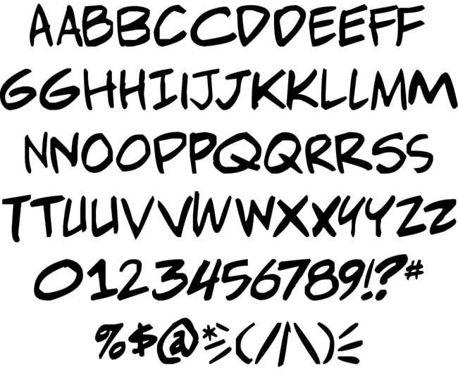
All the dialog will be in the same font, black and in capitals. this is because after doing some research and looking at various comics the font is usually the same and in capitals. |

|
|
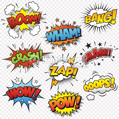
In terms of onomatopoeia, I want these to be presented in colourful shaped boxes, with capital font which is big and readable to really display the sound through the text. Here is an example of the type of ways I will be presenting sound effects in the Sofia Storm comic.
This way of showing onomatopoeia is a really good way of telling the reader what a sound sounds like and also how much it impacts a scene within a comic for example 'BANG!' all in caps, an exclamation mark and with a cloud behind the text really shows that sound is loud and probably has caused some damage due to the cloud behind in. |
M1: PRODUCE A STORYBOARD TO ILLUSTRATE THE FLOW OF THE STORY
D1: EVALUATE THE FEASIBILITY FOR FURTHER DEVELOPMENT OF THE MAIN CHARACTER IN FUTURE STORIES ACROSS DIFFERENT MEDIA FORMATS
